Using PYTRAJ in Jupyter Notebook
Overview
Teaching: 25 min
Exercises: 0 minQuestions
What tools are available to analyze my MD-data?
How to setup Jupyter for simulation analysis?
Objectives
Learn how to set up and use Jupyter notebook on Alliance clusters.
What is PYTRAJ?
PYTRAJ is a Python front end to AMBER’s CPPTRAJ package. The CPPTRAJ software provides an array of high-level analysis commands, as well as batch processing capabilities. You can perform many operations on raw MD trajectories with PYTRAJ/CPPTRAJ. For example, convert between trajectory formats, process groups of trajectories generated with ensemble methods, create average structures, create subsets of the system, etc. A large number of files can be handled by PYTRAJ in parallel, and it can handle very large trajectory sizes.
There are more than 50 types of analysis in PyTRAJ, including RMS fitting, measuring distances, B-factors, radii of gyration, radial distribution functions, and time correlations. In PyTRAJ, parallelization is implemented by MPI, and its use is relatively straightforward. You won’t have to write complicated code or know much about MPI to use it.
MDAnalysis, MDTraj, Pteros, LOOS/PyLOOS are other useful MD analysis packages. These packages provide libraries that can be used to compose analysis programs. Even though this approach offers great flexibility, it will take you longer to master it because it has a steep learning curve.
- PYTRAJ is a Python front end to AMBER’s CPPTRAJ package.
- PYTRAJ offers more than 50 types of analysis
- other useful MD analysis packages: MDAnalysis, MDTraj, Pteros, LOOS/PyLOOS
References:
Installing modules for working with JupyterHub.
Python interacts with Jupyter Notebook servers through IPython kernels. When we loaded the Amber/22 module the appropriate Python and IPython modules were loaded as well. The new IPython kernel has to be added to Jupyter before it can can be accessed from the notebook. The kernel can be named whatever you want, for instance, “env-pytraj”.
- Connect to the training cluster using SSH.
- Run the following commands:
module load StdEnv/2023 amber/22
pip install jupyter nglview==3.1.2 seaborn
python -m ipykernel install --user --name=env-pytraj
We also install two python modules that we will be using:
- NGLview, a Jupyter widget for molecular visualization.
- Seaborn, a Python data visualization library. It extends a popular matplotlib library providing a high-level interface for drawing, templates for attractive and informative statistical graphics.
- Go to JupyterHub and load StdEnv/2023 amber/22 before launching a notebook with env-pytraj kernel.
Installing a Python Virtual Environment and a Jupyter Notebook (only for working without JupyterHub).
Jupyter notebooks are becoming increasingly popular for data analysis and visualization. One of Jupyter notebooks’s most attractive features is its ability to combine different media (code, notes, and visualizations) in one place. Your work is much easier to manage and share with notebooks because everything is kept in one place that you can easily access.
Before going into details of MD analysis with PYTRAJ we need to create a Python virtual environment. The virtual environment is a framework for separating multiple Python installations from one another and managing them. A virtual environment is needed since we will be installing Python modules for this lesson and managing Python modules on Alliance systems is best done in a virtual environment.
In this lesson, we will be using PYTRAJ from AmberTools/22. To setup a python virtual environment first load the AmberTools/22 module:
Load the AmberTools/22 module:
ml --force purge
ml StdEnv/2020 gcc/9.3.0 cuda/11.4 openmpi/4.0.3 ambertools/22
The next step is to install and activate a virtual environment:
Install and activate a virtual environment:
virtualenv ~/env-pytraj
source ~/env-pytraj/bin/activate
Once a virtual environment is installed and activated, we can install the Jupyter Notebook server.
Install Jupyter Notebook server:
pip install --no-index jupyter
Python interacts with Jupyter Notebook servers through IPython kernels. When we loaded the Ambertools/22 module the appropriate Python and IPython modules were loaded as well. The new IPython kernel specification has to be added to Jupyter before the environment env-pytraj can be accessed from the notebook. The kernel can be named whatever you want, for instance, “env-pytraj”.
Add the new IPython kernel specification to Jupyter:
python -m ipykernel install --user --name=env-pytraj
Finally, install three more packages that we will be using:
- NGLview, a Jupyter widget for molecular visualization.
- Pickle, a module providing functions for serializing Python objects (conversion into a byte stream). Objects need to be serialized for storage on a hard disk and loaded back into Python.
- Seaborn, a Python data visualization library. It extends a popular matplotlib library providing a high-level interface for drawing, templates for attractive and informative statistical graphics.
Install three more packages that will be used in this tutorial:
pip install nglview pickle5 seaborn
As NGL viewer is a Jupyter notebook widget, we need to install and enable Jupyter widgets extension:
jupyter nbextension install widgetsnbextension --py --sys-prefix
jupyter-nbextension enable widgetsnbextension --py --sys-prefix
The nglview Python module provides NGLview Jupyter extension. Thus, we don’t need to install it, but we need to enable it before we can use it:
jupyter-nbextension enable nglview --py --sys-prefix
We are now ready to start Jupyter notebook server. The new Python kernel with the name env-pytraj will be available for our notebooks.
Launching a Jupyter Server
While the following example is for launching Jupyter on the training cluster, the procedure is the same on all other Alliance systems. To launch a Jupyter server on any cluster, you only need to change the name of the login and the compute nodes.
To make AmberTools/22 available in a notebook, we need to load the ambertools/22 module and activate the virtual environment before starting the Jupyter server.
Launching a server involves a sequence of several commands. It is convenient to save them in a file. You can later execute commands from this file (we call this “source file”) instead of typing them every time.
Let’s create a Jupyter startup file for use with AmberTools module, jupyter_launch_ambertools.sh, with the following content:
#!/bin/bash
ml --force purge
ml StdEnv/2020  gcc/9.3.0 cuda/11.4 openmpi/4.0.3 ambertools/22
source ~/env-pytraj/bin/activate
unset XDG_RUNTIME_DIR
jupyter notebook --ip $(hostname -f) --no-browser
Make it executable:
chmod +x jupyter_launch_ambertools.sh
Before starting the Jupyter server, we need to allocate CPUs and RAM for our notebook. Let’s request two MPI tasks because we will learn how to analyze data in parallel.
Submit request of an interactive resource allocation using the salloc command:
salloc --ntasks=2 --mem-per-cpu=1000 --time=4:0:0
Wait for the allocation to complete. When it’s done, you will see that the command prompt changed:
[user100@login1 ~]$ salloc --ntasks=2 --mem-per-cpu=1000 --time=3:0:0
salloc: Granted job allocation 168
salloc: Waiting for resource configuration
salloc: Nodes node1 are ready for job
[user45@node1 ~]$
In this example, salloc allocated the resources and logged you into the compute node node1. Note the name of the node where the notebook server will be running. You will need it to create ssh tunnel.
Now we can start the Jupyter server by executing commands from the file jupyter_launch_ambertools.sh:
./jupyter_launch_ambertools.sh
...
[I 15:27:14.717 NotebookApp] http://node1.int.moledyn.ace-net.training:8888/?token=442c622380cc87d682b5dc2f7b0f61912eb2d06edd6a2079
...
Do not close this window, closing it will terminate the server.
Take a note of:
- the node [node1],
- the port number [8888],
- the notebook access token [442c622380cc87d682b5dc2f7b0f61912eb2d06edd6a2079]
You will need this data to connect to the Jupyter notebook.
Jupiter uses port 8888 by default, but if this port is already used (for example, if you or some other user have already started the server), Jupyter will use the next available port.
Connecting to a Jupyter server
The message in the example above informs that the notebook server is listening at port 8888 of the node1. Compute nodes cannot be accessed directly from the Internet, but we can connect to the login node, and the login node can connect to any compute node. Thus, connection to a compute node should also be possible. How do we connect to node1 at port 8888? We can instruct ssh client program to map port 8888 of node1 to a port on the local computer. This type of connection is called tunneling or port forwarding. SSH tunneling allows transporting networking data between computers over an encrypted connection.
The figure below shows ssh tunnels to node1 and node2 opened by two users via the host moledyn.ace-net.training. In this example, three Jupyter servers started by different users are listening at ports 8888, 8889, and 8890 of each node. Jupyter server of user04 runs at node2:8888, and this user is tunneling it to port 8888 of his local computer. Jupyter server of user34 runs at node1:8890, and this user wanted to use his local port 7945.

Open another terminal tab or window and run the command:
ssh user100@moledyn.ace-net.training -L 8888:node1:8888
Replace the port number and the node name with the appropriate values.
This SSH session created a tunnel from your computer to node1. The tunnel will be active only while the session is running. Do not close this window and do not log out, as this will close the tunnel and disconnect you from the notebook.
Now in the browser on your local computer, you can navigate to localhost:8888, and enter the token when prompted.
Once Jupyter is loaded, open a new notebook. Ensure that you create a notebook with the python kernel matching the active environment (env-pytraj), or the kernel will fail to start!
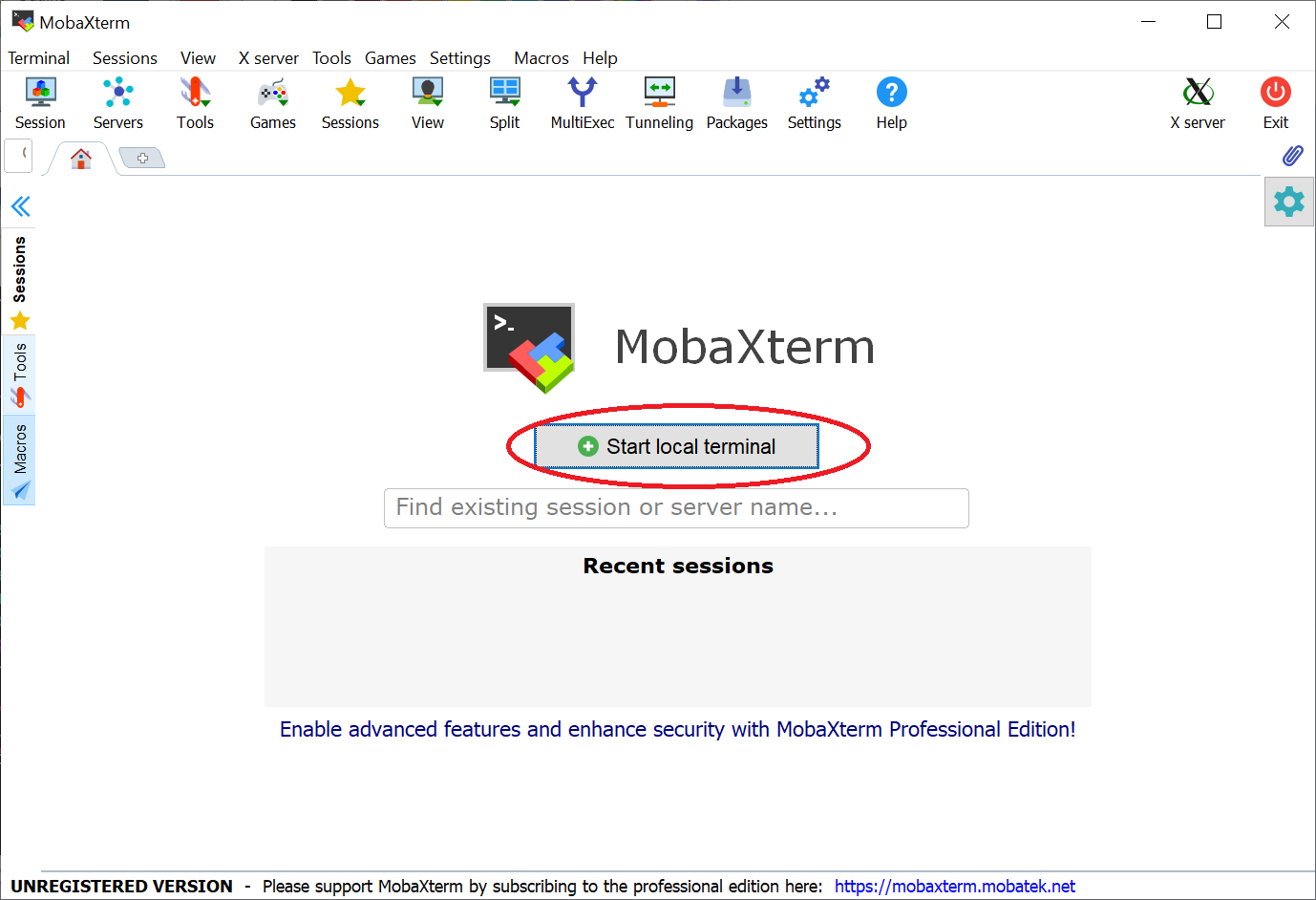
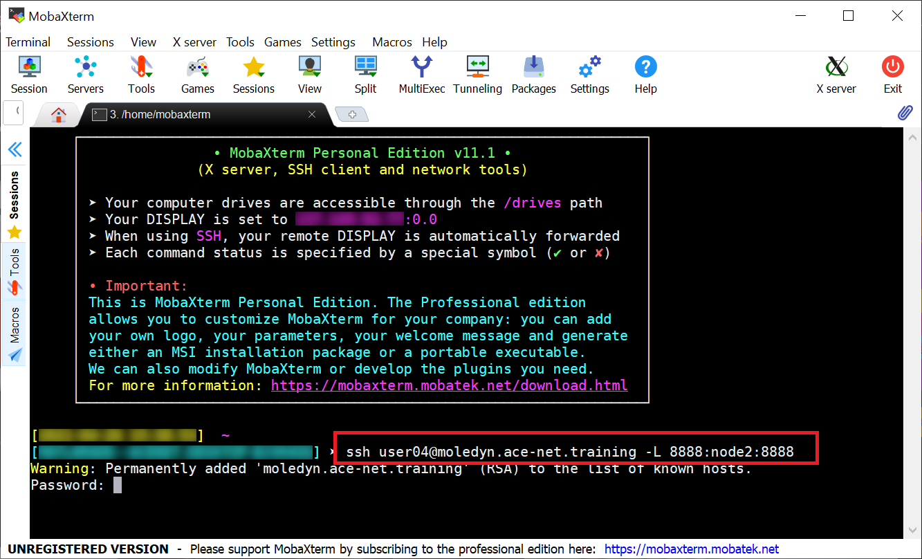
Using MobaXterm (on Windows)
Users of MobaXterm can use the “SSH Session” as usual to open the first terminal tab which they can use to start the interactive job (salloc) and the Jupyter server.
To establish the SSH-tunnels with a second SSH-session, we want to first open a Local terminal:
In the local terminal we then use the same
sshcommand as shown above to create the SSH-tunnel
Uninstalling the IPython kernel:
jupyter kernelspec list
jupyter kernelspec uninstall env-pytraj
Key Points
By keeping everything in one easy accessible place Jupyter notebooks greatly simplify the management and sharing of your work
Plotting Energy Components in Jupyter Notebook
Overview
Teaching: 25 min
Exercises: 0 minQuestions
How to extract energy components from simulation logs?
How to load and plot energy components?
Objectives
Learn to extract energy components from simulation logs
Learn to plot energy components
Extracting Energy Components from Simulation Logs.
We are now ready to use pytraj in the Jupyter notebook. Let’s plot energies from the simulation logs of our equilibration runs.
First, we load pandas and matplotlib modules. Then move into the directory where the input data files are located:
import pandas as pd
import matplotlib.pyplot as plt

%cd ~/workshop_pytraj/example_01
Extract some energy components (total energy, temperature, pressure, and volume) from the equilibration log and save them in the file energy.dat:
!./extract_energies.sh equilibration_1.log
File extract_energies.sh is shell script calling cpptraj program to do the job:
#!/bin/bash
echo "Usage: extract_energies simulation_log_file"
log=$1

cpptraj << EOF
readdata $log
writedata energy.dat $log[Etot] $log[TEMP] $log[PRESS] $log[VOLUME] time 0.1
EOF
Plotting energy components
Read the data saved in the file energy.dat into a pandas dataframe and plot it:
df=pd.read_table('energy.dat', delim_whitespace=True)
df.columns=["Time", "Etot", "Temp", "Press", "Volume"]
df.plot(subplots=True, x="Time", xlabel="Time, ps", figsize=(6, 8))
plt.show()
Key Points
The Basics of PYTRAJ
Overview
Teaching: 25 min
Exercises: 0 minQuestions
How to load MD-trajectories into PYTRAJ?
How to calculate RMSD to a reference?
Objectives
Learn how to calculate and plot RMSD
Learn how to run analysis in parallel using MPI
Computing RMSD
We are now ready to use pytraj in a Jupyter notebook.
import pytraj as pt
import numpy as np
from matplotlib import pyplot as plt

%cd ~/workshop_pytraj/example_02
Load the topology and the trajectory:
traj=pt.iterload('mdcrd_nowat.xtc', top='prmtop_nowat.parm7')
- You can load a single filename, a list of filenames or a pattern.
- There are two functions for loading trajectories
- The
ptraj.iterloadmethod returns a frame iterator object. This means that it registers what trajectories will be processed without actually loading them into memory. One frame will be loaded at a time when needed at the time of processing. This saves memory and allows for analysis of large trajectories. - The
ptraj.loadmethod returns a trajectory object. In this case all trajectory frames are loaded into memory.
You can also select slices from each of the trajectories, for example load only frames from 100 to 110 from mdcrd_nowat.xtc:
traj_slice=pt.iterload('mdcrd_nowat.xtc', top='prmtop_nowat.parm7', frame_slice=[(100, 110)])
To compute RMSD we need a reference structure. We will use the initial pdb file to see how different is our simulation from the experimental structure. Load the reference frame:
ref_coor = pt.load('inpcrd_nowat.pdb')
- You can also use any trajectory frame, for example
ref_coor = traj[0]as a reference structure.
Before computing RMSD automatically center and image molecules/residues/atoms that are outside of the box back into the box.
traj=traj.autoimage()
Generate time axis for RMSD plot. The trajectory was saved every 0.001 ns, and we have 3140 frames.
time=np.linspace(0, 3.139, 3140)
Compute and plot RMSD of the protein backbone atoms. We can compute and plot RMSD using the initial pdb file and a frame from the trajectory as reference structure.
rmsd_ref = pt.rmsd(traj, ref=ref_coor, nofit=False, mask='@C,N,O')
rmsd_first= pt.rmsd(traj, ref=traj[0], nofit=False, mask='@C,N,O')
plt.plot(time,rmsd_ref)
plt.plot(time,rmsd_first)
plt.xlabel("Time, ns")
plt.ylabel("RMSD, $ \AA $")
plt.show()
Slicing trajectories
Other ways to slice a trajectory:
print(traj[-1])     # The last frame
print(traj[0:8])    # Frames 0 to 7
print(traj[0:8:2])  # Frames 0 to 7 with stride 2
print(traj[::2])    # All frames with stride 2
print(traj(0,20,4)) # Creates frame iterator with (start, stop, step)
Exercise
- Compute and plot RMSD of all nucleic acid atoms (residues U,A,G,C) excluding hydrogens for all frames.
- Compute and plot RMSD of all protein atoms (residues 1-859) excluding hydrogens for frames 1000-1999.
- Repeat using coordinates from frame 500 as a reference.
View Atom selection syntaxSolution
time1=np.linspace(0,3.139,3140)
rmsd1 = pt.rmsd(traj, ref=ref_coor, nofit=False, mask='(:U,A,G,C)&!(@H=)')
time2=np.linspace(1,1.999,1000)
rmsd2 = pt.rmsd(traj(1000,2000), ref=ref_coor, nofit=False, mask='(:1-859)&!(@H=)')
plt.plot(time1,rmsd1)
plt.plot(time2,rmsd2)
plt.xlabel("Time, ns")
plt.ylabel("RMSD, $ \AA $")
Distributed Parallel RMSD Calculation
import pytraj as pt
import numpy as np
from matplotlib import pyplot as plt
import seaborn as sns
import pickle

cd ~/workshop_pytraj/example_02
To process trajectory in parallel we need to create a Python script file rmsd.py instead of entering commands in the notebook. This script when executed with srun will use all available MPI tasks. Each task will process its share of frames and send the result to the master task. The master task will “pickle” the computed rmsd data and save it as a Python object.
To create the Python script directly from the notebook we will use Jupyter magic command %%file.
%%file rmsd.py

import pytraj as pt
import pickle
from mpi4py import MPI

# initialize MPI
comm = MPI.COMM_WORLD

# get the rank of the process
rank = comm.rank

# load the trajectory file
traj=pt.iterload('mdcrd_nowat.xtc', top='prmtop_nowat.parm7')
ref_coor = pt.load('inpcrd_nowat.pdb')

# call pmap_mpi function for MPI.
# we dont need to specify the number of CPUs,
# because we will use srun to run the script
data = pt.pmap_mpi(pt.rmsd, traj, mask='@C,N,O', ref=ref_coor)

# pmap_mpi sends data to rank 0
# rank 0 saves data
if rank == 0:
    with open("rmsd.dat", "wb") as fp:
         pickle.dump(data, fp)
Run the script on the cluster. We will take advantage of the resources we have already allocated when we launched Jupyter server and simply use srun without requesting anything:
! srun python rmsd.py
In practice you will be submitting large analysis jobs to the queue with the sbatch command from a normal submission script requesting the desired number of MPI tasks (ntasks).
When the job is done we import the results saved in the file rmsd.dat into Python:
with open("rmsd.dat", "rb") as fp:
    data=pickle.load(fp)
rmsd=data.get('RMSD_00001')
Set *seaborn* plot theme parameters and plot the data:
sns.set_theme()
sns.set_style("darkgrid")
time=np.linspace(0,3.139,3140)
plt.plot(time,rmsd)
plt.xlabel("Time, ns")
plt.ylabel("RMSD, $ \AA $")
Key Points
By keeping everything in one easy accessible place Jupyter notebooks greatly simplify the management and sharing of your work
Trajectory Visualization in Jupyter Notebook
Overview
Teaching: 25 min
Exercises: 0 minQuestions
How to visualize simulation in Jupyter notebook?
Objectives
Learn how to use NGLView to visualize trajectories.
Interactive trajectory visualization with NGLView
Data Visualization is one of the essential skills required to conduct a successful research involving molecular dynamics simulations. It allows you (or other people in the team) to better understand the nature of a process you are studying, and it gives you the ability to convey the proper message to a general audience in a publication.
NGLView is a Jupyter widget for interactive viewing molecular structures and trajectories in notebooks. It runs in a browser and employs WebGL to display molecules like proteins and DNA/RNA with a variety of representations. It is also available as a standalone Web application.
Open a new notebook. Import pytraj, nglview and make sure you are in the right directory
import pytraj as pt
import nglview as nv
%cd ~/workshop_pytraj/example_02
Quick test - download and visualize 1si4.pdb.
import nglview as nv
view = nv.show_pdbid("1si4")
view
Load the trajectory:
traj=pt.iterload('mdcrd_nowat.xtc', top = 'prmtop_nowat.parm7', frame_slice=[(0,1000)])
Take care of the molecules that moved out of the initial box. The autoimage function will automatically center and image molecules/residues/atoms that are outside of the box back into the initial box.
traj = traj.autoimage()
Create NGLview widget
view = nv.show_pytraj(traj)
- The defaults selection is all atoms
Render the view. Try interacting with the viewer using Mouse and Keyboard controls.
view
Create second view and clear it
view2=nv.show_pytraj(traj)
view2.clear()
Add cartoon representation
view2.add_cartoon('protein', colorScheme="residueindex", opacity=1.0)
Render the view.
view2
Change background color and projection
view2.background="black"
view2.camera='orthographic'
Add more representations. You can find samples of all representations here.
view2.remove_cartoon()
view2.add_hyperball(':B or :C and not hydrogen', colorScheme="element")
Change animation speed and step
view2.player.parameters = dict(delay=0.5, step=1)
Make animation smoother
view.player.interpolate = True
Try visualizing different atom selections. Selection language is described here
- You can use GUI
view4=nv.show_pytraj(traj) view4.display(gui=True) - Use filter to select atoms
- Create nucleic representation
- Use hamburger menu to change representation properties
- Change
surfaceTypeto av - Use
colorValueto change color - Check wireframe box
- Try full screen
- Add nucleic representation hyperball
Set size of the widget programmatically
view3=nv.show_pytraj(traj)
view3._remote_call('setSize', target='Widget', args=['700px', '440px'])
view3
view3.clear()
- Add representations
view3.add_ball_and_stick('protein', opacity=0.3, color='grey')
view3.add_hyperball(':B or :C and not hydrogen', colorScheme="element")
view3.add_tube(':B or :C and not hydrogen')
view3.add_spacefill('MG',colorScheme='element')
Try changing display projection
view3.camera='orthographic'
https://github.com/ComputeCanada/molmodsim-pytraj-analysis/blob/gh-pages/code/Notebooks/pytraj_nglview.ipynb
Useful links
- AMBER/pytraj
- NGL viewer
- Color maps
References
Key Points
Principal Component Analysis
Overview
Teaching: 25 min
Exercises: 0 minQuestions
How to perform principal component analysis?
How to visualize principal components with VMD
Objectives
Perform principal component analysis
Visualize principal components with VMD
Principal component analysis
Principal components can be thought of as a way to explain variance in data. Through PCA, very complex molecular motion is decomposed into orthogonal components. Once these components are sorted, the most significant motions can be identified.
PCA involves diagonalizing the covariance matrix to eliminate instantaneous linear correlations between atomic coordinate fluctuations. We call the largest eigenvectors of the covariance matrix, principal components (PC). After PC are sorted according to their contribution to the overall fluctuations of the data, the first PC describes the largest variance and so forth.
Researchers have found that only a few of the largest principal components are able to accurately describe the dominant motion of the system. Thus, a PCA provides insight into the dynamics of a system by identifying the most prominent motions.
PCA is a complex procedure with many steps. It uses the coordinate covariance matrix calculated from the molecular dynamics trajectory.
- To prepare the trajectory for PCA, the coordinates are fitted to a reference frame to eliminate global translations and rotations.
- Next, the coordinate covariance matrix (the matrix of deviations from the average structure) is calculated and diagonalized. The diagonalization procedure yields the eigenvectors and the eigenvalues (the contribution of each eigenvector to the total fluctuations).
- Once we determine which eigenvectors (principal components) are the largest, we can project trajectory coordinates onto each of them. The term trajectory here refers to a transformed trajectory, in which the coordinates represent each atom’s deviation from its average position. When we project this trajectory onto a PC, we will obtain a pseudo-trajectory that is a representation of motion along the principal component.
All PCA steps are performed automatically by the pca module of ptraj.
import pytraj as pt
import nglview as nv
import numpy as np
import parmed
from matplotlib import pyplot as plt

%cd ~/workshop_pytraj/example_02
Register all trajectory frames for analysis and move molecules back to the initial box.
frames=pt.iterload('mdcrd_nowat.xtc', top = 'prmtop_nowat.parm7')
frames = frames.autoimage()
- The results are saved in the structure data
- Projection values of each frame to each of the 5 modes are saved in the arrays data[0][0], … , data[0][4]
- Eigvenvalues of the first 5 modes are saved in the array data[1][0]
- Eigvenvectors of first 5 modes are saved in the arrays data[1][1][0], … , data[1][1][4]
Perform PCA analysis
- Analyze 39 nucleic acid residues, 6 backbone atoms in each residue. The total number of atoms included in the analysis is 234, so eigenvectors will be 234 elements long.
- Request calculations of the three first principal components
data = pt.pca(frames, mask=":860-898@O3',C3',C4',C5',O5',P", n_vecs=5)
print('Projection values of each frame to the first mode = {} \n'.format(data[0][0]))
print('Eigvenvalues of the first 5 modes:\n', data[1][0])
print('Eigvenvector of the first mode:\n', data[1][1][0])
- Plot projection of each frame on the first two modes
- Color by frame number
plt.scatter(data[0][0], data[0][1], cmap='viridis', marker='o', c=range(frames.n_frames), alpha=0.5)
plt.xlabel('PC1')
plt.ylabel('PC2')
cbar = plt.colorbar()
cbar.set_label('frame #')
When you look at such plot and see two or more clusters this means that several different conformations exist in the simulation. Our graph shows that the first component separates data into two clusters. The first cluster existed in the beginning of the simulation, and later in the simulation the average projection on this component shifted from 10 to -5. This example trajectory is too short for any reliable conclusion. The results suggest that the system may not yet reached equilibrium.
Visualizing normal modes with VMD plugin Normal Mode Wizard
Download the file “modes.nmd”
scp user100@moledyn.ace-net.training:workshop_pytraj/example_02/modes.nmd .
- Open VMD
- Go to
Extensions->Analysis->Normal Mode Wizard->Load NMD File - Navigate to the file
modes.nmd - In the popup window
NMWiz - PCA modelschose theActive modeand pressAnimation-Makebox.
Key Points
Cross-correlation Analysis
Overview
Teaching: 25 min
Exercises: 0 minQuestions
How to perform cross-correlation analysis?
How to visualize cross-correlation matrices
Objectives
Learn to perform cross-correlation analysis
Learn to visualize cross-correlation matrices
Cross-correlation analysis.
Collective motions of atoms in proteins are crucial for the biological function. Molecular dynamics trajectories offer insight into collective motions, which are difficult to see experimentally. By analyzing atomic motions in the simulation, we can identify how all atoms in the system are dynamically linked.
This type of analysis can be performed with the dynamic cross-correlation module atomiccorr. The module computes a matrix of atom-wise cross-correlation coefficients. Matrix elements indicate how strongly two atoms i and j move together. Correlation values range between -1 and 1, where 1 represents full correlation, and -1 represents anticorrelation.
import pytraj as pt
import nglview as nv
import numpy as np
import matplotlib.pyplot as plt
import seaborn as sns

%cd ~/workshop_pytraj/example_02
We will analyze two fragments of the simulation system:
- Protein fragment (residues 50-150).
- Nucleic acids.
Visualize the whole system
Let’s visualize the whole system before running correlation analysis. This will help to understand where the fragments of the system chosen for analysis are located.
- Load 20 equispaced frames from the 2 ns - long trajectory for visualization
- Move atoms back into the initial box
- Center the view using alpha carbon atoms of the protein.
trj_viz=pt.iterload('mdcrd_nowat.xtc', top='prmtop_nowat.parm7', frame_slice=[(0,1999,100)])
trj_viz=trj_viz.autoimage()
trj_viz.center('@CA origin')
- Create view of the loaded data
- Set orthographic projection
- Remove the default ball/stick representation
- Add nucleic acids represented with tube
- Add protein surface
- Add protein residues 50-150 represented with cartoon
view1 = trj_viz.visualize()
view1.camera='orthographic'
view1.clear()
view1.add_tube('nucleic')
view1.add_hyperball('nucleic and not hydrogen', colorScheme="element")
view1.add_surface('protein', color='grey', opacity=0.3)
view1.add_cartoon('50-150', color='cyan')
view1
Analyze dynamic cross-correlation map for the protein atoms.
We will use residues 50-100, these residues represent a fragment of the protein molecule.
- Load all trajectory frames for analysis
traj=pt.iterload('mdcrd_nowat.xtc', top='prmtop_nowat.parm7')
- Calculate correlation matrix for residues 50-150
corrmat=pt.atomiccorr(traj, mask=":50-150 and not hydrogen")
- Plot correlation matrix using heat map
- Set center of the color scale to 0
sns.heatmap(corrmat, center=0, xticklabels=5, yticklabels=5, square=True)
Intrepretation of the correlation map
- Close to diagonal are interaction between neighbours
- Off-diagonal correlations are due to the specific protein folding pattern
- Are there any negative correlations? Try rescale and plot only negative correlations (use vmax=0).
Calculate dynamic cross-correlation map for the nucleic acids.
In this example we will compare cross-correlation maps computed for different time windows of the molecular dynamics trajectory, and learn how to plot positive and negative correlations in one figure.
Visualize nucleic acids
- Create view
- Set orthographic projection
- Remove the default representation
- Add nucleic backbone represented with tube
- Add nucleic acids represented with hyperball to the view
- Open the interactive view
view = trj_viz.visualize()
view.camera='orthographic'
view.clear()
view.add_tube('nucleic')
view.add_hyperball('nucleic and not hydrogen', colorScheme="element")
view
- To find the numbers of the first and the last nucleic acid residue hover with the mouse cursor over the terminal atoms.
Compute correlation map for frames 1-500
As this chunk of the trajectory is already loaded, we just need to recompute the correlation matrix using different atom mask.
traj1 = pt.iterload('mdcrd_nowat.xtc', top='prmtop_nowat.parm7', frame_slice=[(1, 600)])
corrmat1=pt.atomiccorr(traj1, mask =":860-898 and not hydrogen")
Compute correlation map for frames 1600-1999
Load the second chunk of the trajectory and compute the correlation matrix
traj2 = pt.iterload('mdcrd_nowat.xtc', top='prmtop_nowat.parm7', frame_slice=[(2500, 3140)])
corrmat2=pt.atomiccorr(traj2, mask =":860-898 and not hydrogen")
Create lower and upper triangular masks
Weak negative correlations are hard to see in one figure. Using separate color maps for negative and positive correlations can help to show weaker negative correlations clearly. To achieve this we can set the minimum value for the positive plot, and the maximum value for the negative plot to zero.
We can then combine plots of positive and negative correlations in one plot by showing positive correlations in the upper triangle of the correlation map, and negative correlations in the lower triangle. This can be achieved by removing the lower triangle from the plot of positive correlations, and removing the upper triangle from the plot of negative correlations. To do this we need to create masks for upper and lower triangles.
maskl = np.tril(np.ones_like(corrmat1, dtype=bool))
masku = np.triu(np.ones_like(corrmat1, dtype=bool))
Try different color schemes
#cmap=sns.diverging_palette(250, 30, l=65, center="dark", as_cmap=True)
cmap=sns.diverging_palette(220, 20, as_cmap=True)
#cmap=sns.color_palette("coolwarm", as_cmap=True)
#cmap=sns.color_palette("Spectral", as_cmap=True).reversed()
#cmap=sns.diverging_palette(145, 300, s=60, as_cmap=True)
Plot correlation maps for two trajectory time windows
- Create figure with two subplots.
fig, (ax1,ax2) = plt.subplots(2, figsize=(9,9))
- Plot correlation map for frames 1-500 (axis ax1)
- First plot positive correlations (vmin=0), then negative (vmax=0)
sns.heatmap(corrmat1, mask=maskl, cmap=cmap, center=0.0,vmin=0.0,
            square=True, xticklabels=2, yticklabels=2, ax=ax1)
sns.heatmap(corrmat1, mask=masku, cmap=cmap, center=0.0, vmax=0.0,
            square=True,ax=ax1)
- Plot correlation map for frames 1600-1999 (axis ax2)
- First plot positive correlations (vmin=0), then negative (vmax=0)
sns.heatmap(corrmat2, mask=maskl, cmap=cmap, center=0.0,vmin=0.0,
            square=True, xticklabels=2, yticklabels=2, ax=ax2)
sns.heatmap(corrmat2, mask=masku, cmap=cmap, center=0.0, vmax=0.0,
            square=True,ax=ax2)
Interpretation of the map features
- Correlations between neighbours do not exist between chains (21 is not correlated with 22)
- Off diagonal correlations correspond to hydrogen bonds between the two RNA chains
- Negative correlations change with time
Dynamical cross-correlation matrices
Key Points